Tahweel
A self-initiated redesign of Tahweel, a MENA app for instant gaming top-ups, mobile recharges, gift cards, and eSIMs. Concept work — never handed over or implemented.
- Discipline
- Mobile app redesign
- Role
- UI / UX Design

This one had no client and no brief. I use the product, kept noticing the same friction, and set myself the exercise of reworking it around how quickly someone can finish a task they have already done a dozen times.
Nothing here was commissioned by Tahweel, delivered to their team, or shipped. It is a personal study of an app I know well.
An app that sells many different digital products drifts towards being a catalogue, when most people open it to repeat one purchase they have made before.
Restructured the home screen around repeat purchases instead of around the product catalogue.
The first thing a returning user sees is what they bought last time, one tap from buying it again. Categories still exist, but they are somewhere you go when you want something new, not the toll you pay on every visit. Checkout was rebuilt around confidence: what is being bought, for which account, at what price, and when it arrives — all visible before the payment step rather than after it.
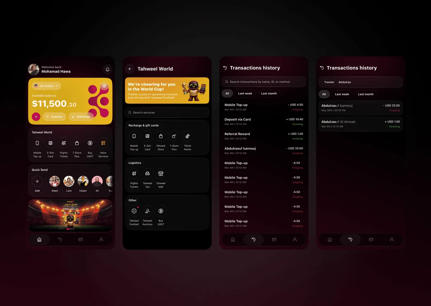
The home screen leads with what this person actually buys, so the common case takes one tap.
Four unrelated product types stop competing for attention and get their own focused space.
Account, price, and delivery are confirmed before payment, where the doubt actually happens.
A concept, explored end to end.
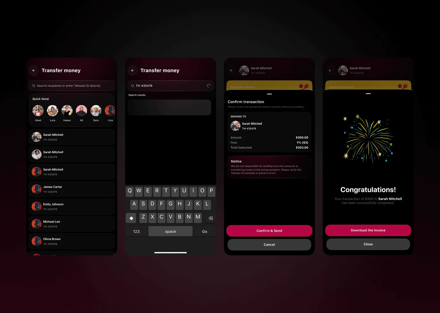
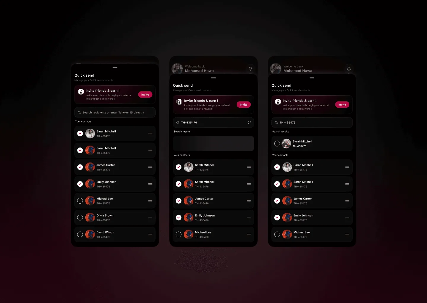
Redesigning something nobody asked you to redesign is a good way to find out whether you understand the problem or just dislike the layout.
The interesting constraint here was restraint: the existing product works, and most of what I changed was hierarchy rather than features. If it were ever built, the next step would be checking the repeat-purchase assumption against real usage data rather than my own habits.